We talk a lot about variables in this blog, because graphs are a visual way of presenting the relationship between variables. If you want to brush up on types of variables before finding out how they are used in graphs, check out these two blogs:
For the 101 on command words in GCSE Biology, look at this very helpful guide:
To find video tutorials covering maths skills in Biology, go to the My GCSE Science search and enter the term “maths skills”. This will return all the relevant videos. Below the tutorials you can find exam-style questions where you can apply the knowledge you’ve learnt from the tutorials and also mark schemes, so that you can assess your progress!
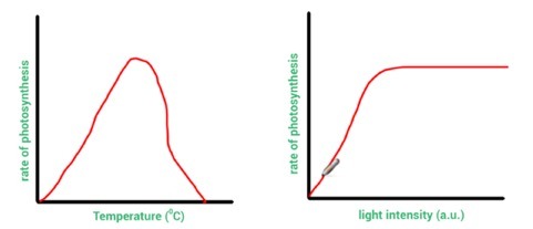
When asked to describe patterns in graphs, you ‘say what you see’. To describe the graph in Figure 1, for example, you could say: “The rate of photosynthesis increases as temperature increases until a set temperature where the rate then falls back to zero.” If you can see numbers on the graph’s scales, you should also quote some values to validate your descriptions.
Figure 1 Figure 2
When asked to explain graphs, you give reasons for each trend in the bars or lines on the graph. Aim to use the word “because”.
In Figure 1, the rate of photosynthesis increases when temperature increases because temperature increases the kinetic energy store of the enzyme and substrate molecules used in photosynthesis. There are more effective collisions and more product is formed, until a set temperature because this is the optimum temperature for these enzymes. However, the rate of photosynthesis falls after this point because the enzymes have become denatured.
In questions where you are asked to compare, you need to comment on both the similarities and differences.
For example, to compare the graph in Figure 1 with the graph in Figure 2 you would say that as both independent variables increase so does the rate of photosynthesis. You could add that both independent variables are referred to as ‘limiting factors’ at this stage.
Now the similarities are covered, you then need to focus on the differences. When pointing out differences, it’s helpful to use the words ‘however’, ‘while’ or ‘instead of’.
When comparing Figure 1 with Figure 2 you could say: “In Figure 2, as the light intensity continues beyond a certain point, the rate of photosynthesis stays constant (because either carbon dioxide or temperature is now a limiting factor). However, in Figure 1, after a certain temperature the rate of photosynthesis falls rather than stays constant as temperature is still a limiting factor but is now having a negative influence on the reaction.
If values are given in an exam question, then try to use these values in the comparisons you make.
A line graph can reveal a correlation between two variables, but it cannot distinguish between causation and coincidence. Causation can only be verified if all other variables have been effectively controlled and there is evidence of a scientific reason for the causation.
A line of best fit helps to illustrate relationships between two variables that are continuous.
A straight line of best fit shows us that the relationship between two variables is linear. The relationship between the variables is proportional if the straight line of best fit goes through the origin – the point (0, 0) – and also has a positive gradient, which means it slopes upwards to the right.
Many relationships are directly proportional. This means that, when one variable changes, the other changes by the same proportion. For example, if one variable doubles, the other variable doubles as well.
If there is a positive correlation between two variables, this means that as one variable increases, the other does as well. A negative correlation tells us that, as one variable increases, the other decreases. In the exam, if more than one mark is offered in a question, using these mathematical terms correctly can gain you extra marks.
The line of best fit could also be a curve. A curve is common in rates of reaction graphs. A straight line would indicate a constant rate of reaction, while a curve indicates a change in the rate (or speed) of a reaction over time. If a straight line or curve flattens into a horizontal line, that indicates no further change in the rate of the reaction from a certain level.
Lines of best fit are also useful in identifying anomalous results and outliers which will not lie on the line of best fit. Lines of best fit can also be extrapolated (extended). This allows us to use a graph to predict values which lie outside the range of the available data.
These questions can be challenging. But read the example below and with a little practice you’ll be able to tackle two-graph questions and gain precious marks. The main thing to remember is that you really need to use all the clues provided in the question to answer it effectively.
Example question:
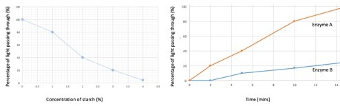
“Iodine is a semi-transparent orange colour when in solution. In the presence of starch, it will turn a dark, almost opaque blue-black colour. In the production of slimming foods, starch is broken down into glucose by carbohydrase enzymes, before being converted to fructose sugar by isomerase enzymes. Scientists investigated the effect that two types of carbohydrase enzyme had on the breakdown of starch. In order to move on to the isomerase part of the process, the starch needs to be broken down to a concentration of 2%. How long will this take for the most effective carbohydrase enzyme? Use information from both graphs in Figure 3 below. Show clearly how you worked out the answer”.
Figure 3
How to answer:
First, find the percentage of light for a 2% concentration of starch. On the first graph read up from 2% concentration on the x axis and across to the y axis where you find that for this concentration, 40% of light passes through. Then, use this value on the second graph. Enzyme A achieves 40% light passing through before Enzyme B, which means Enzyme A is more effective. Reading across from 40% to the line for Enzyme A and then down to the time axis, it takes 5 minutes for Enzyme A to break the starch down to a concentration of 2%.
Job done! 🙂
Katie Ross